← All work
Brand identity · 2026
Swank Pharm
A brand identity built from two letters and a leaf
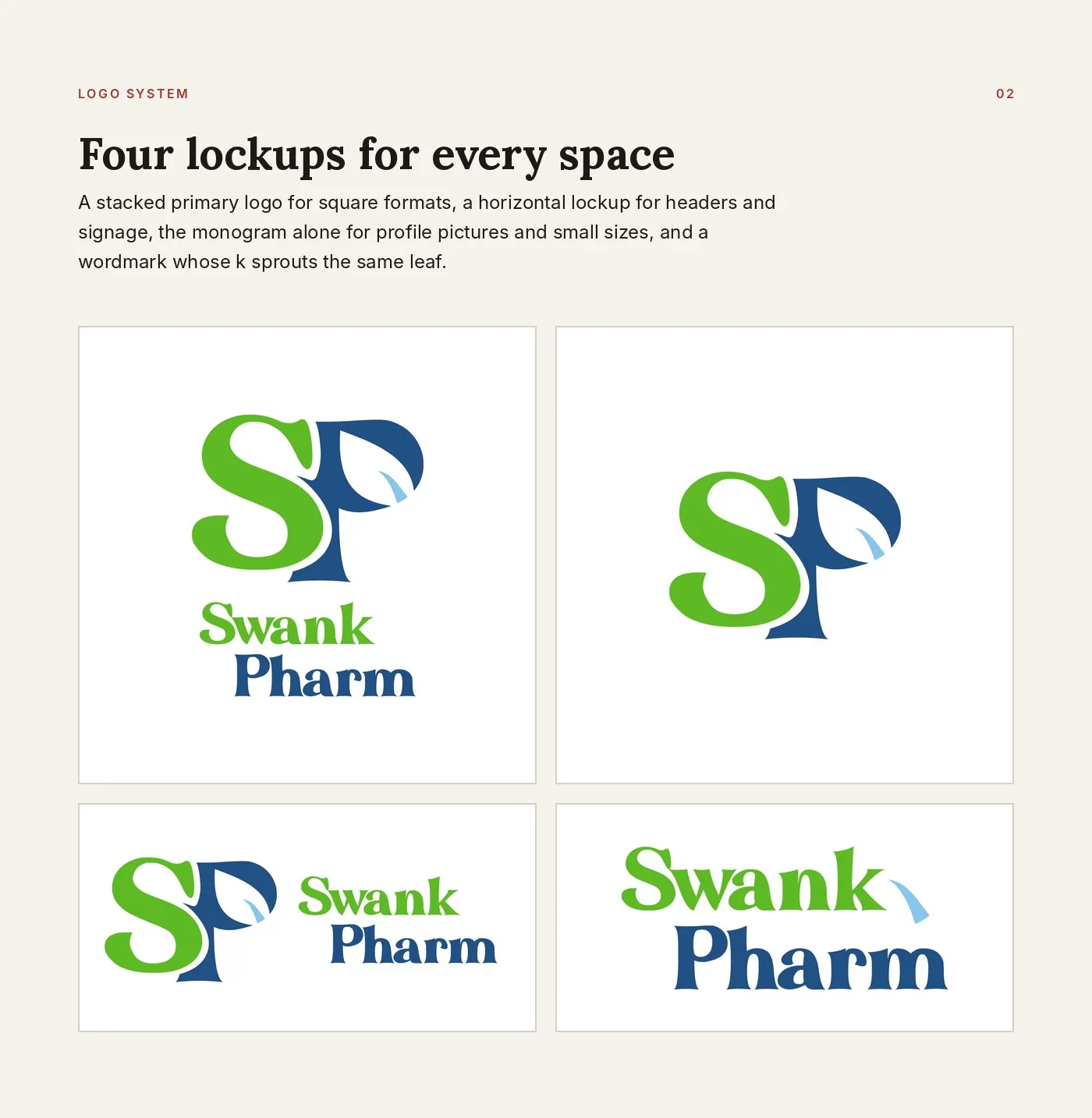
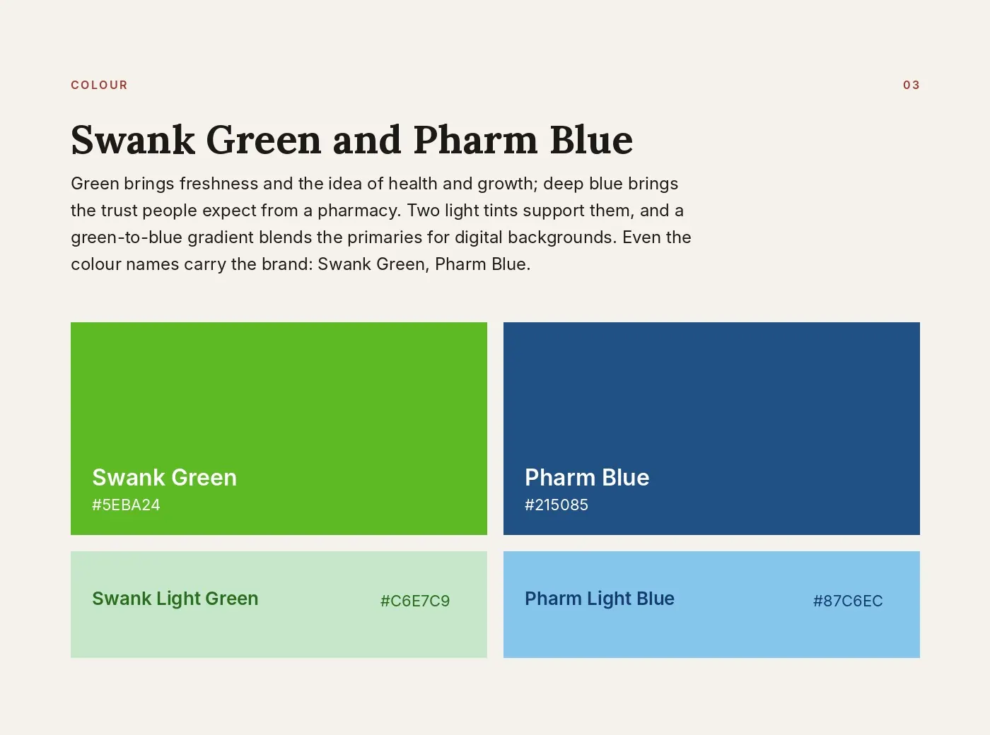
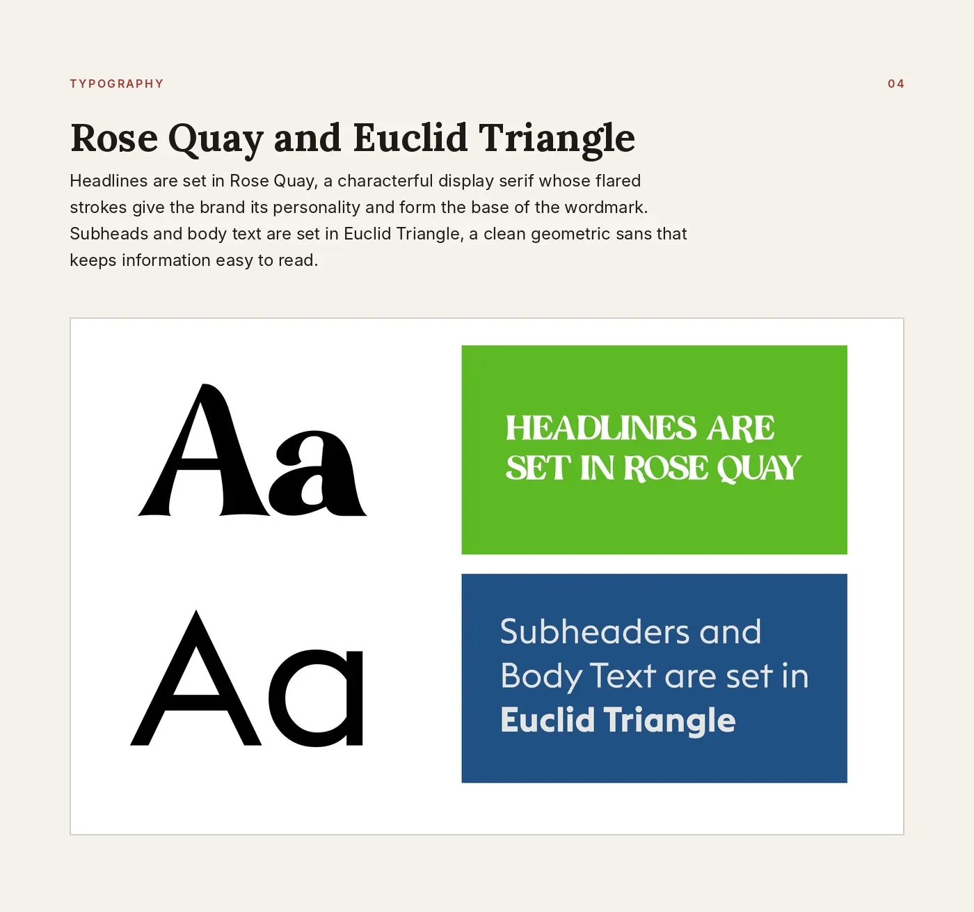
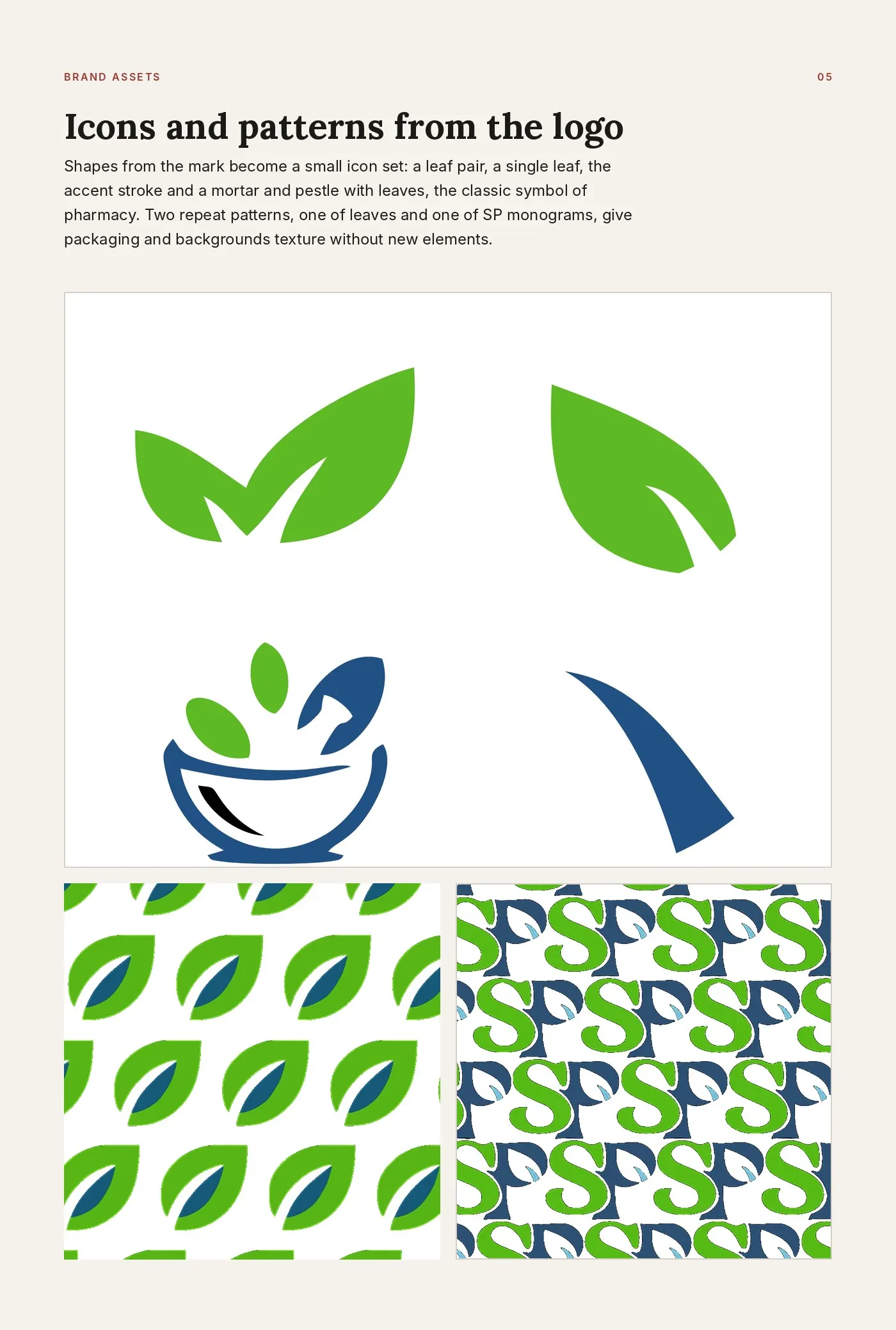
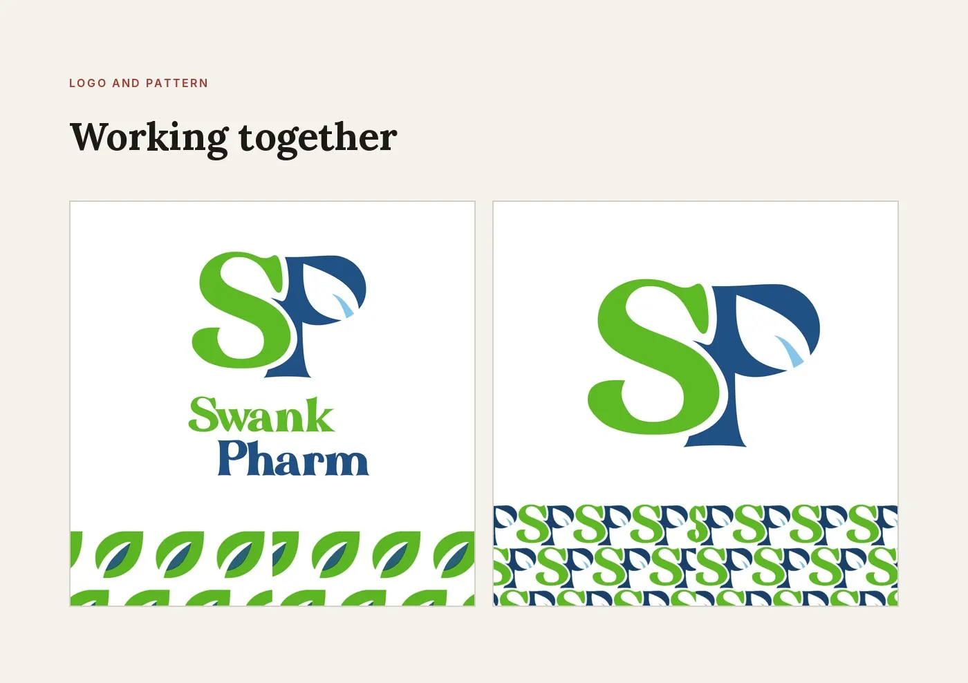
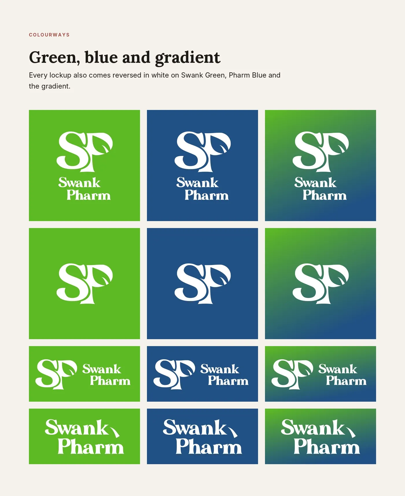
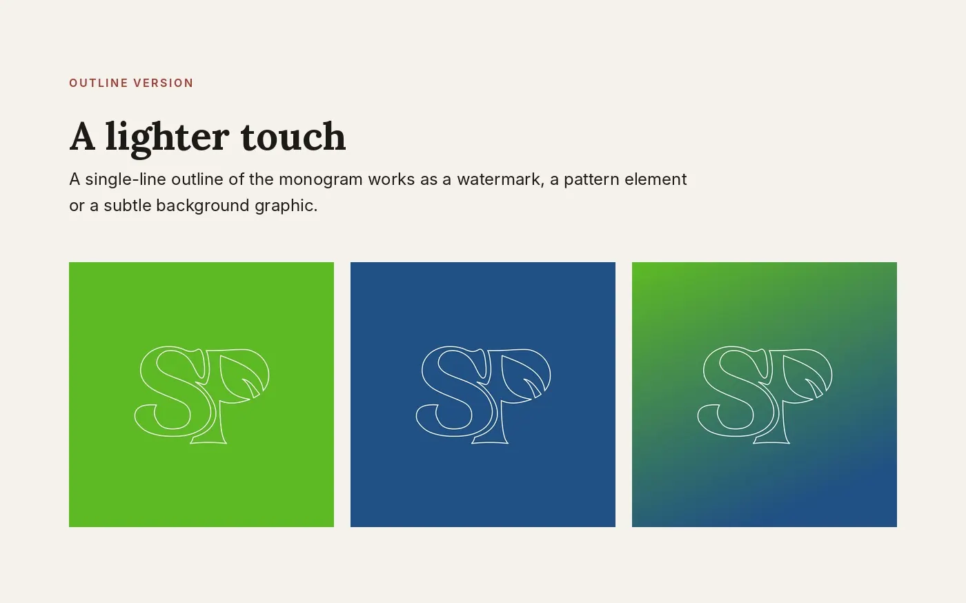
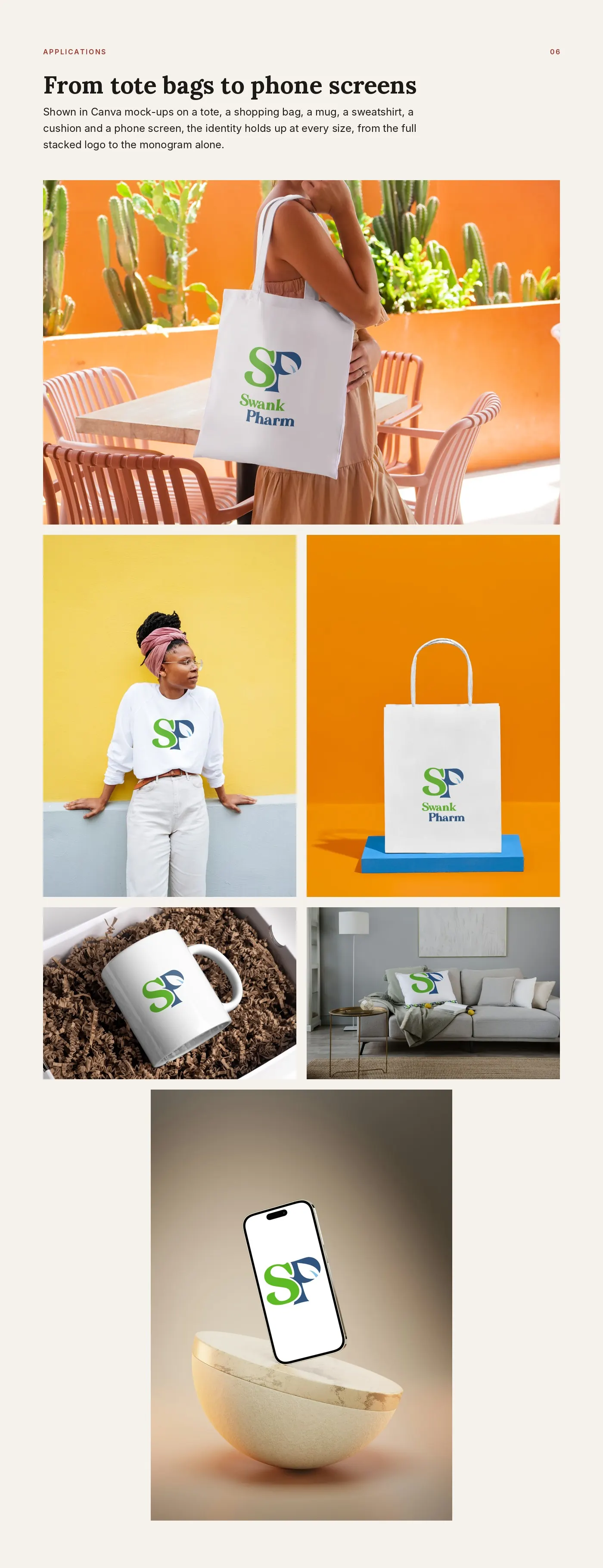
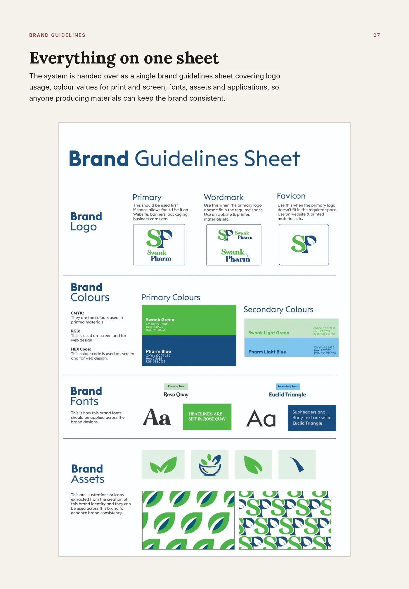
Swank Pharm is a pharmacy that needed an identity both fresh and trustworthy. Through BuzzDesignz, I designed the complete identity: an SP monogram with a leaf grown into the P, stacked and horizontal lockups, a wordmark, colour palette, typography, brand icons, two repeat patterns and a one-page brand guidelines sheet, then tested it all on merchandise and digital mock-ups.
- Client
- Swank Pharm, via BuzzDesignz
- Year
- 2026
- Tools
- CorelDRAW, Photoshop, Canva
- Scope
- Logo, colour, type, icons, patterns, guidelines